A Beginner's Guide to Candlestick Charts

Introduction
For newcomers to trading or investing, deciphering charts can often seem like navigating a labyrinth. Some may opt to trust their instincts, basing investments on gut feelings. While this approach might yield temporary success in a bullish market, its long-term efficacy is doubtful.
Trading and investing are essentially about playing the odds and managing risks. Thus, understanding how to read candlestick charts is crucial for nearly all investment strategies. This guide will demystify candlestick charts, explaining their importance and how to interpret them.
What is a Candlestick Chart?
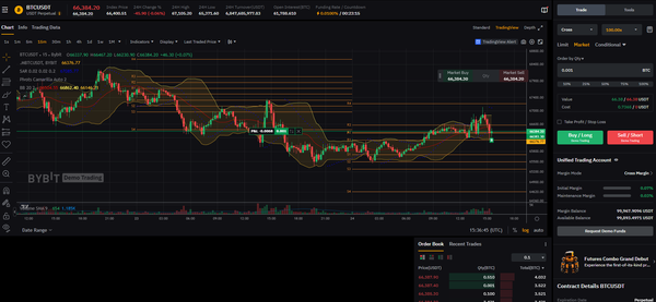
A candlestick chart is a financial chart that visually represents an asset's price movements over a specified timeframe, using 'candlesticks' to denote each period. These periods can range from mere seconds to years, making candlestick charts incredibly versatile.
The origins of candlestick charts trace back to the 17th century, credited to a Japanese rice trader named Homma. His insights laid the groundwork for the modern candlestick chart, later refined by figures like Charles Dow, a pioneer of technical analysis.
Primarily used in financial market analysis, candlestick charts are invaluable for traders and investors, aiding in the prediction of price movement probabilities.
How Do Candlestick Charts Work?
To construct a candlestick, four key price points are necessary:
- Open: The asset's first trading price in the timeframe.
- High: The highest trading price in the timeframe.
- Low: The lowest trading price in the timeframe.
- Close: The last trading price in the timeframe.


These points, collectively known as OHLC values, shape the candlestick's appearance. The 'body' of the candlestick represents the open-close range, while the 'wicks' or 'shadows' extend to the high and low prices. The entire high-low range is known as the candlestick's range.
Reading Candlestick Charts
Candlestick charts, offering a straightforward depiction of price action, are often deemed more accessible than traditional bar or line charts. They encapsulate the tug-of-war between buyers and sellers within a given period. A long body indicates strong buying or selling pressure, while short wicks suggest the closing price was near the period's high or low.
Chart colors vary by tool, but typically, a green body signifies a closing price higher than the opening, while red indicates a decrease. Some analysts prefer black-and-white charts, using hollow candles for price increases and filled ones for decreases.

Limitations of Candlestick Charts
Despite their utility, candlestick charts have limitations. They don't detail the intra-period price action, only the open-close range and extremities. Moreover, while changing the timeframe can offer more granularity, candlestick charts can also introduce 'market noise,' complicating the interpretation of rapid price changes.
Heikin-Ashi Candlesticks
Beyond traditional Japanese candlesticks, the Heikin-Ashi technique offers an alternative. Meaning "average bar" in Japanese, Heikin-Ashi candlesticks use a modified formula to average price data, aiming to smooth price action and reduce market noise. This can help in identifying trends, patterns, and potential reversals more clearly.
Heikin-Ashi candlesticks are often used alongside traditional candlesticks to mitigate false signals and enhance trend detection. However, they also come with drawbacks, such as delayed pattern formation and obscured price gaps.
Closing Thoughts
Candlestick charts are indispensable for traders and investors, offering a visual summary of price action and the flexibility to analyze various timeframes. Mastery of candlestick patterns, coupled with analytical skills and practice, can provide a competitive edge. Nonetheless, integrating other analysis methods, like fundamental analysis, is widely recommended for a well-rounded strategy.


